Industry: Health · Mental Wellness Role: Brand Strategist · Creative Director Deliverables: Brand Guide · Web · Print Duration: 6 Months

Kindness —
Brand Strategy &
Visual Identity

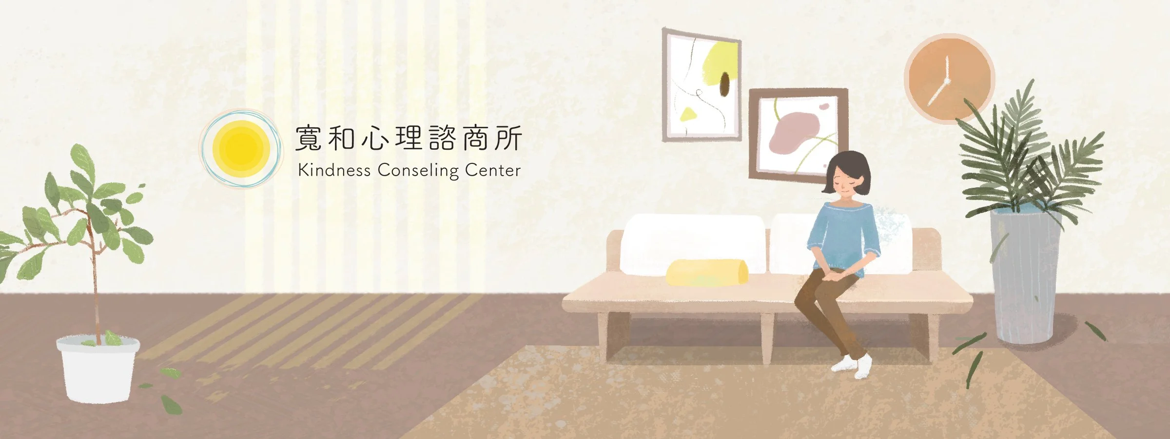
A new counseling center entering a growing but stigma-laden market needed a brand that could make someone feel safe before they ever walked through the door.

Problem

Mental health demand in Taiwan is rising fast, but stigma and judgment keep people from seeking help. A first-time counseling brand can't afford to feel cold, clinical, or corporate.

Approach

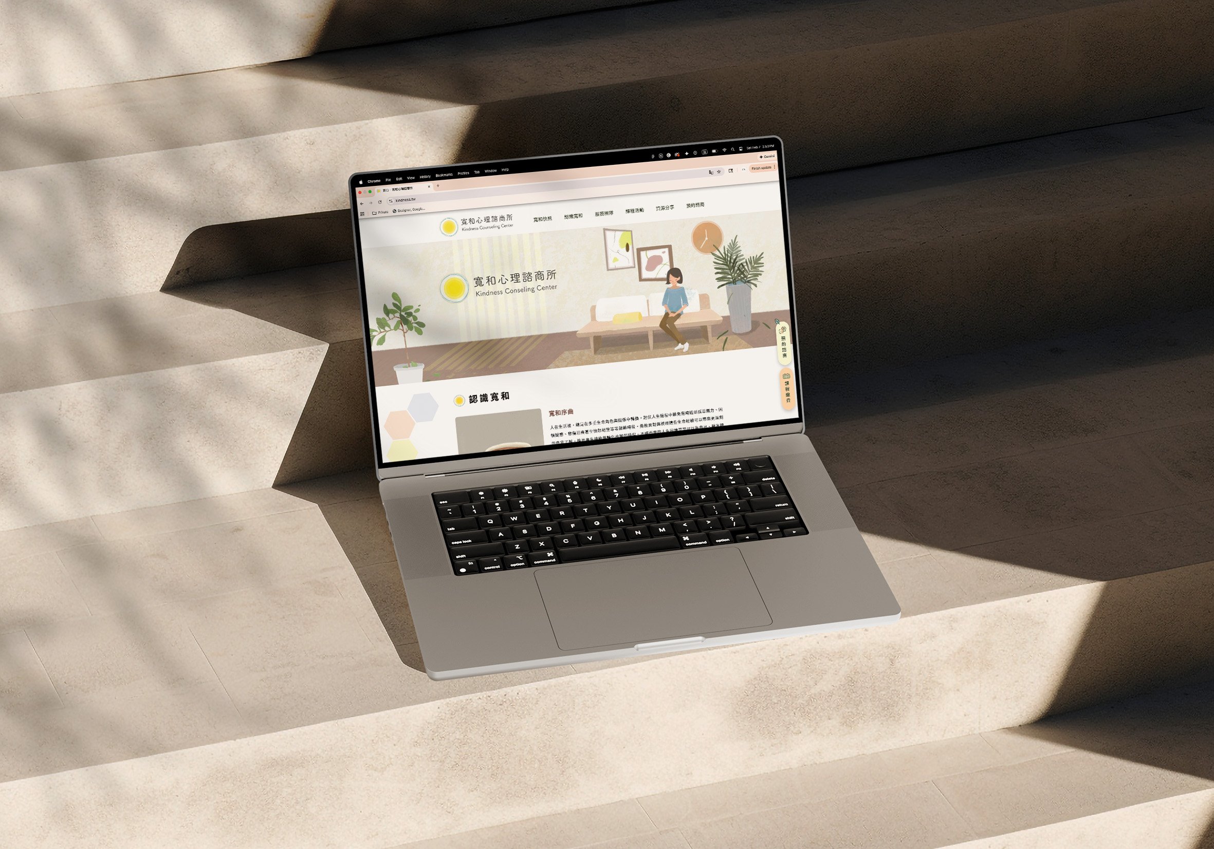
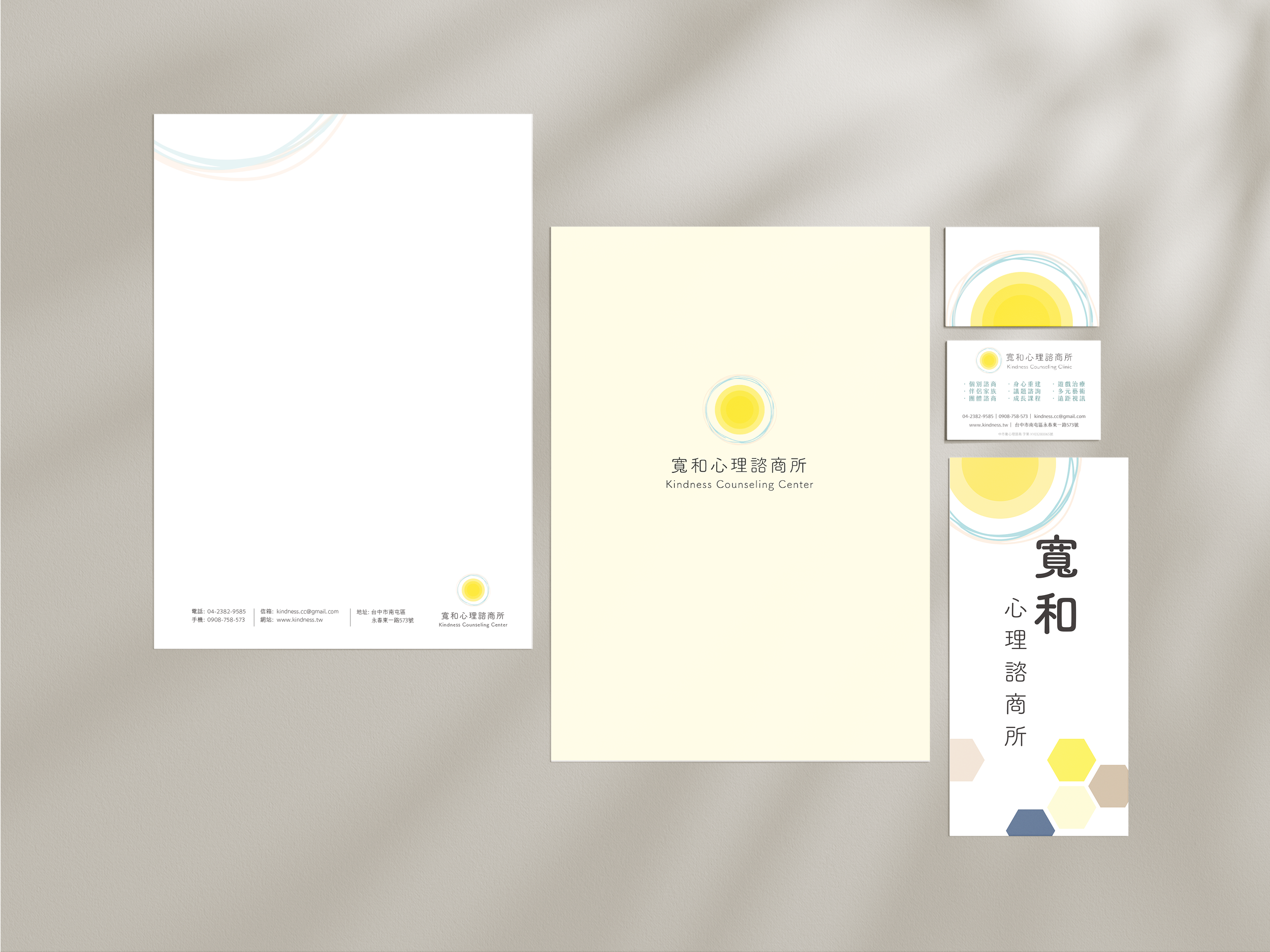
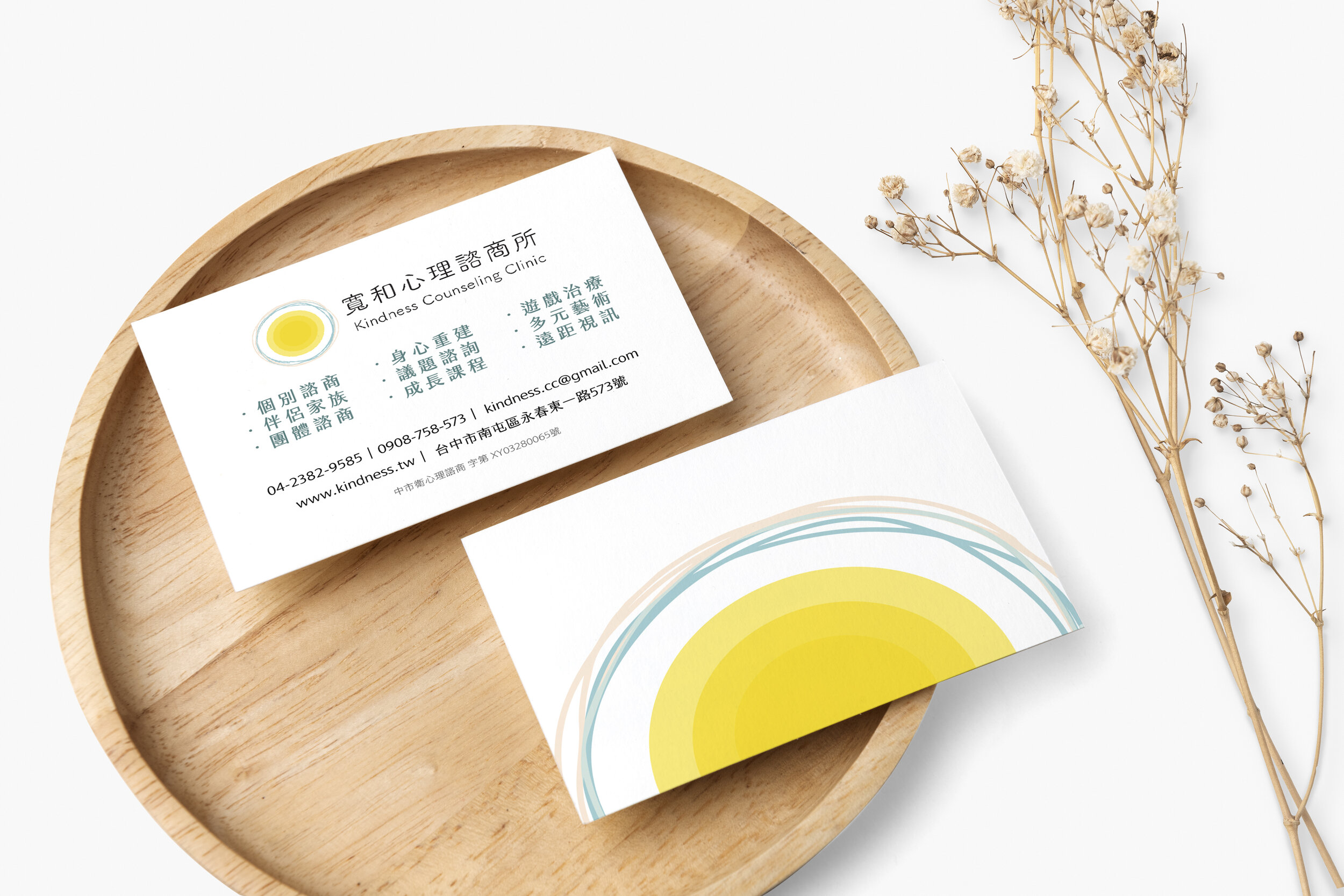
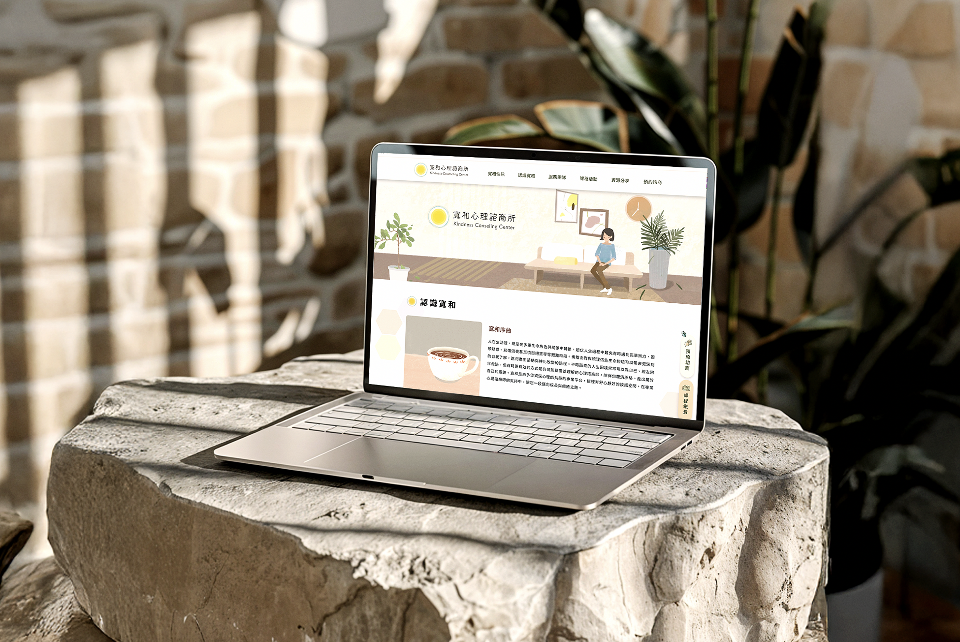
Built a complete brand system anchored in three emotional states — hope, grounding, and growth — translating them into color, typography, motion, and a full print and web asset suite.

Outcome

End-to-end delivery: brand guide, animated identity, print collateral, and web handoff specs — with QA cycles alongside the dev team to maintain fidelity through production.

Kindness Consulting Center

Strategy first, visuals second

Counseling visits in Taichung rose 12% between 2020 and 2022, while antidepressant usage climbed ~47% since 2013. Demand was real — but so was the stigma. People didn't need more information; they needed a brand that felt safe enough to take the first step.

For 寬和, brand design wasn't a cosmetic layer — it was the first point of therapeutic contact. Every visual decision had to earn trust before a single word was read.

"Facing these experiences with courage can lead to deeper self-awareness, acceptance, and meaningful transformation."

Anchor 01

Hope

Warm as light. Primary CTAs and highlights. Guides without pushing.

Anchor 02

Grounding

Calm stability. Background tones and negative space. Holds the space without filling it.

Anchor 03

Growth

Restoration. Supporting information and wayfinding. Forward motion without urgency.

Color System

Sunlight Yellow

Hope · Primary CTAs

Warm Beige

Stability · Backgrounds

Olive Green

Growth · Wayfinding

Cream

Negative Space

Deep Warm Black

Typography

Motion carried the same emotional weight as color. The animated identity was designed to breathe — slow, looping, never jarring — signaling a brand that won't rush you.

Kindness brand animation

A complete brand system, ready to scale

Delivered a full-scope brand system: identity guidelines, print collateral (brochures, posters, postcards), and a structured web handoff — component kit, type scale, spacing rules, and illustration assets. Led QA cycles with the development team to ensure the visual language held through every production stage.

Website mockup
Stationery
Print materials
Space photography
Website design

← Previous

Kai Ming Inc

Next Project →

AI Workflow: Soothing Zone