Problem
Kai Ming's fragmented identity failed to build trust with grant funders — or feel approachable to the multilingual families it served.
What I Did
Led end-to-end rebrand and UX redesign — from strategic positioning to multilingual web architecture — managing stakeholders, timelines, and cross-functional handoffs over 3+ years.
Result
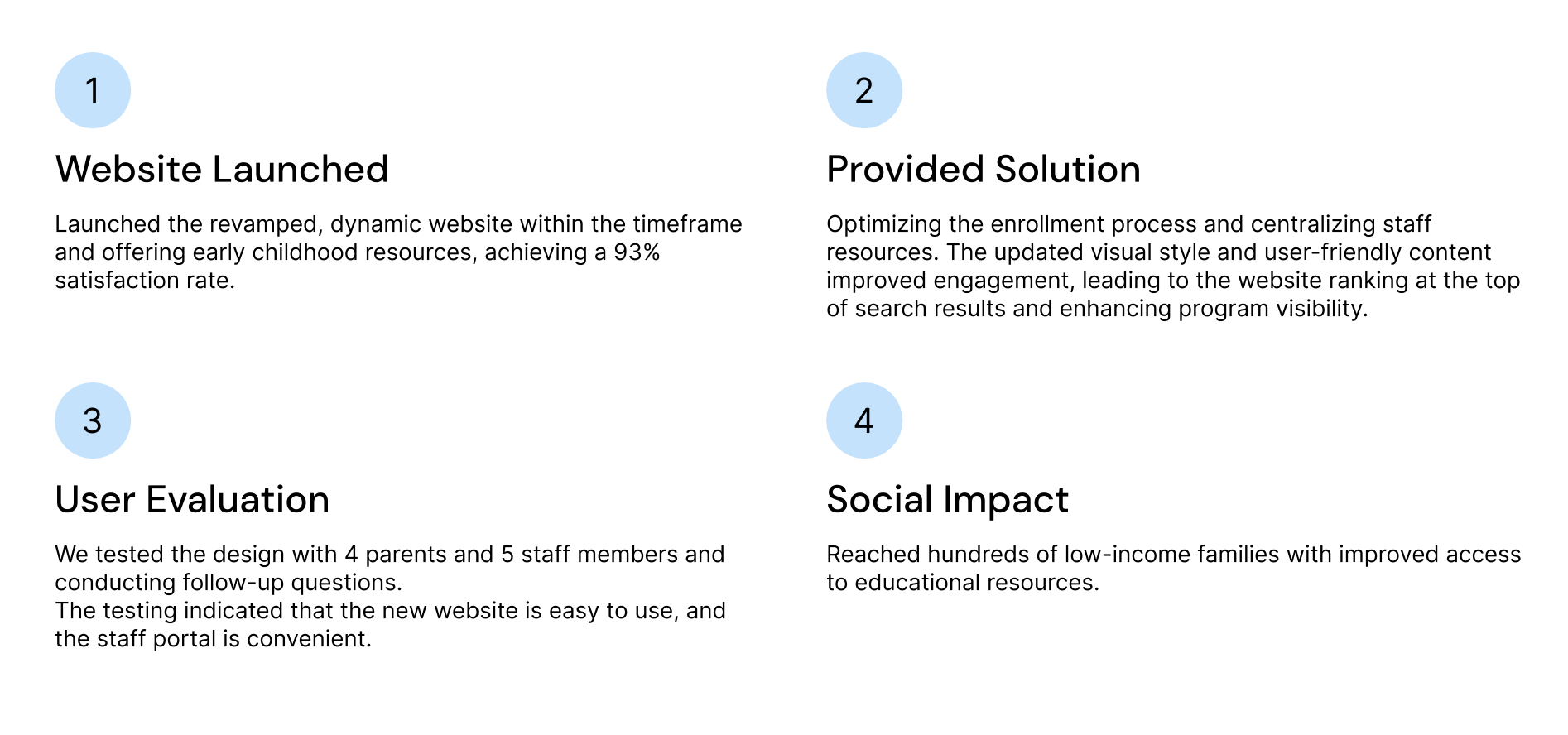
93% user satisfaction rate. Staff support load cut by over 90%. Stronger institutional credibility with funders and increased enrollment inquiries.
93%
User satisfaction
rate post-launch
90%+
Reduction in
staff support load
3.4yr
Long-term brand
stewardship
The Problem
A brand that couldn't serve two audiences at once
Kai Ming needed to earn trust from two very different audiences simultaneously: grant funders who expect institutional credibility, and multilingual low-income families who need warmth and clarity. The existing brand did neither. The logo was outdated, the website was hard to navigate for non-English speakers, and the lack of visual consistency undermined confidence at every touchpoint. The design challenge wasn't aesthetic — it was strategic.
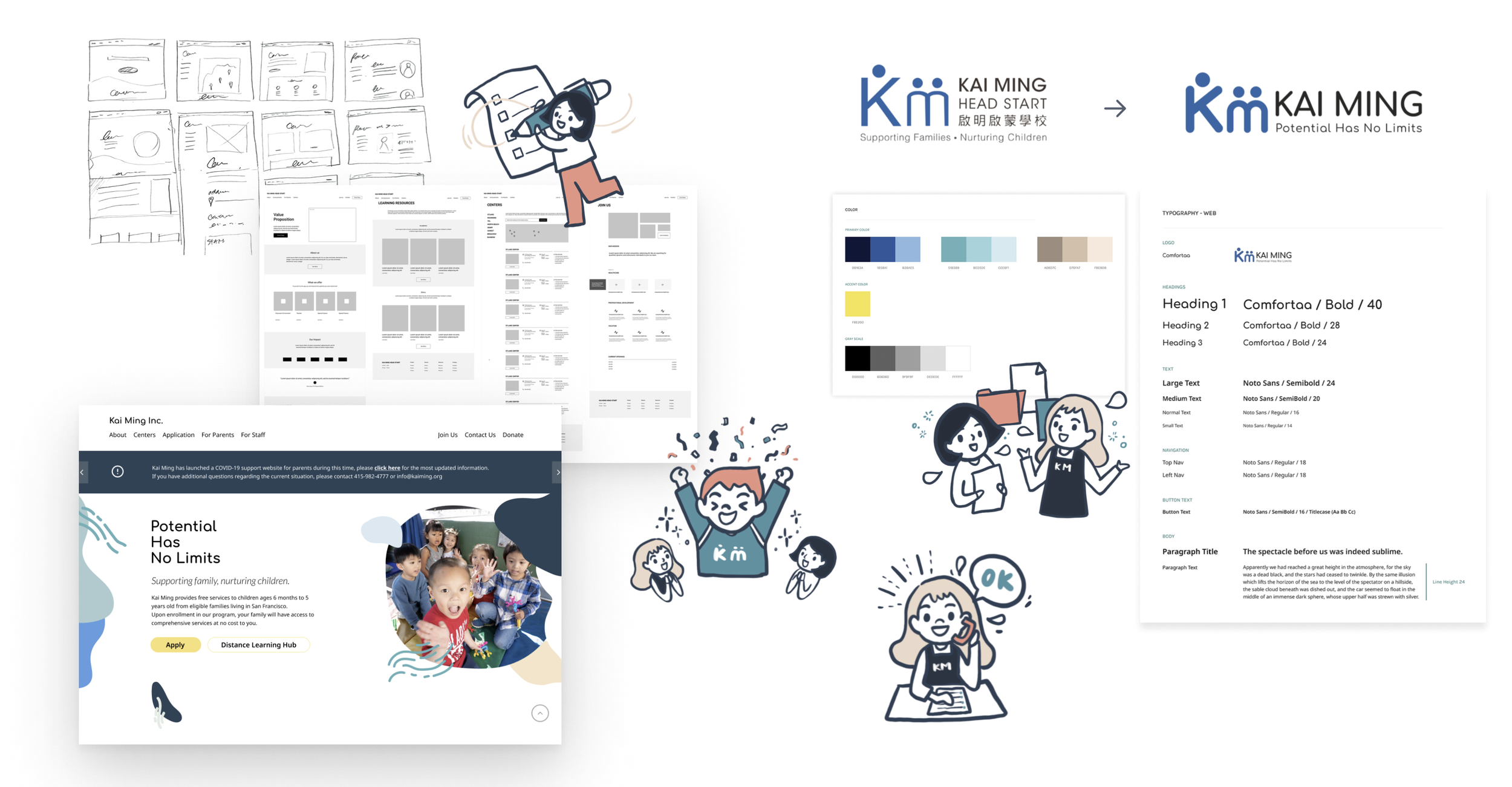
Design Process
Strategic decisions at every stage
01
Discovery
Interviews with parents, educators, and leadership to map trust gaps — and define what the brand needed to say to each audience
02
Brand Strategy
Positioned Kai Ming between institutional credibility and community warmth — a deliberate tension that shaped every visual decision
03
Identity System
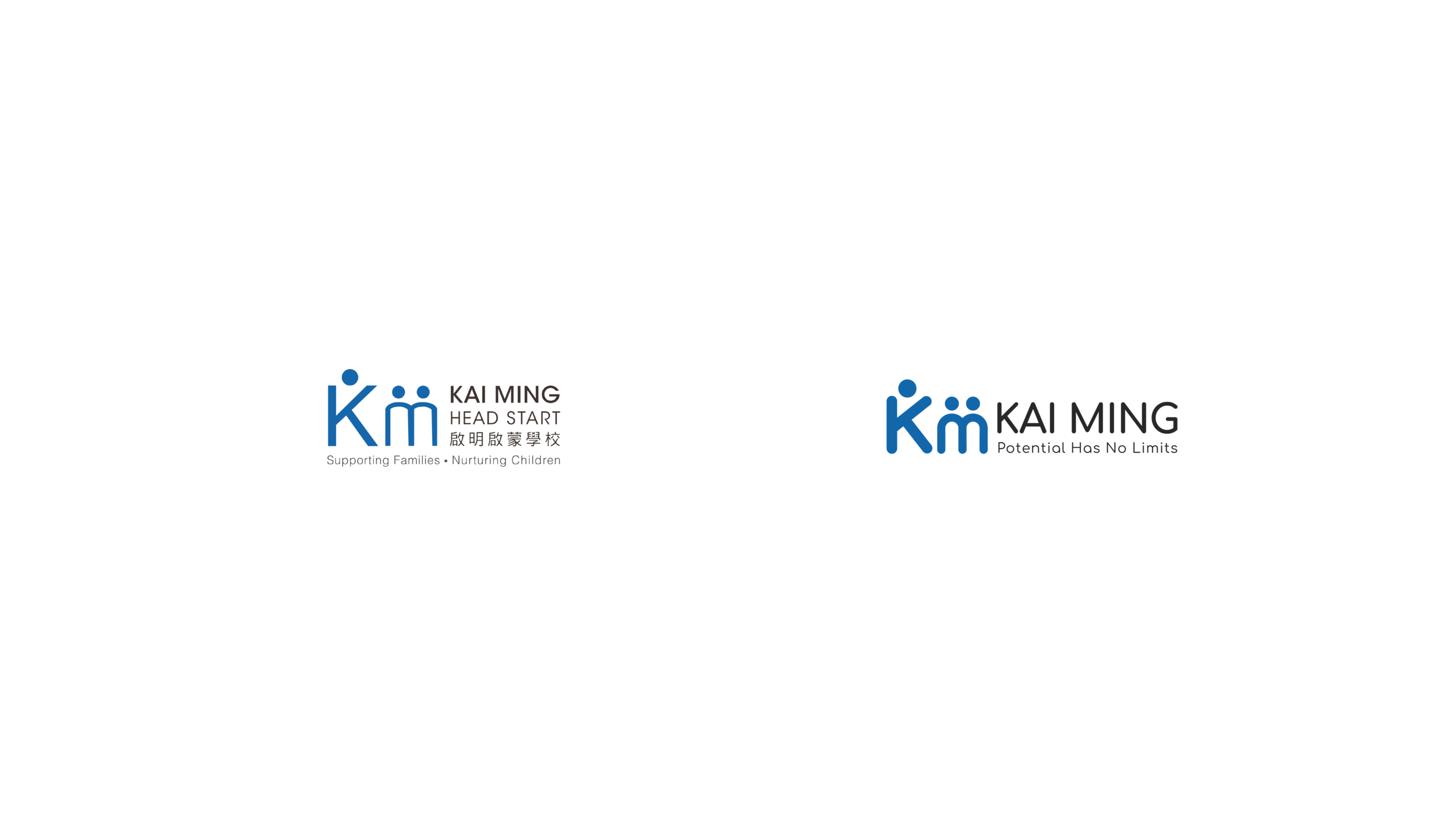
New logo, color, type, and illustration language — designed to flex from formal grant applications to bilingual family flyers without losing coherence
04
PM & Rollout
Managed phased rollout across print, web, and campaigns — coordinating stakeholders, vendors, and dev handoff over 3+ years of ongoing brand stewardship
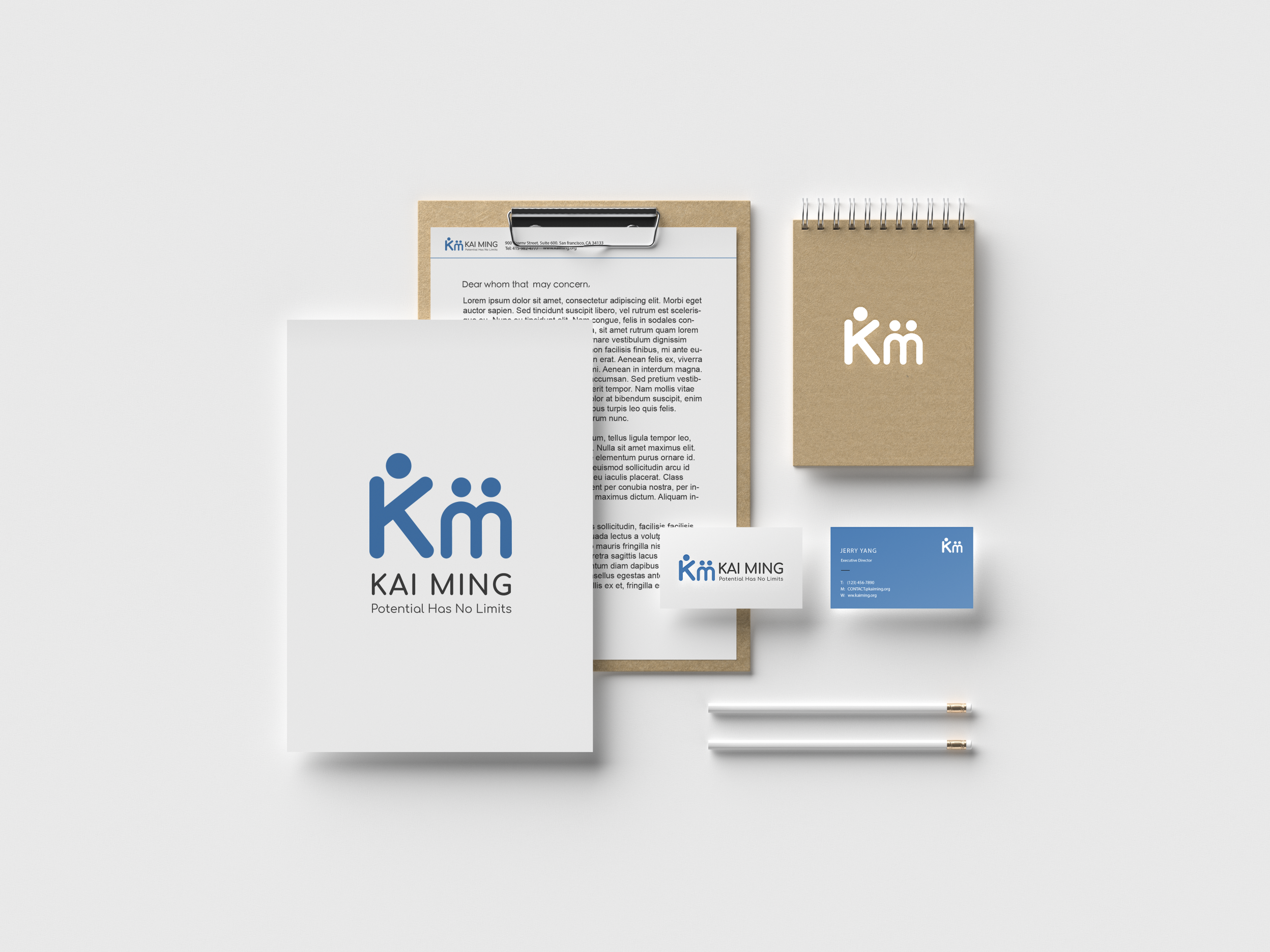
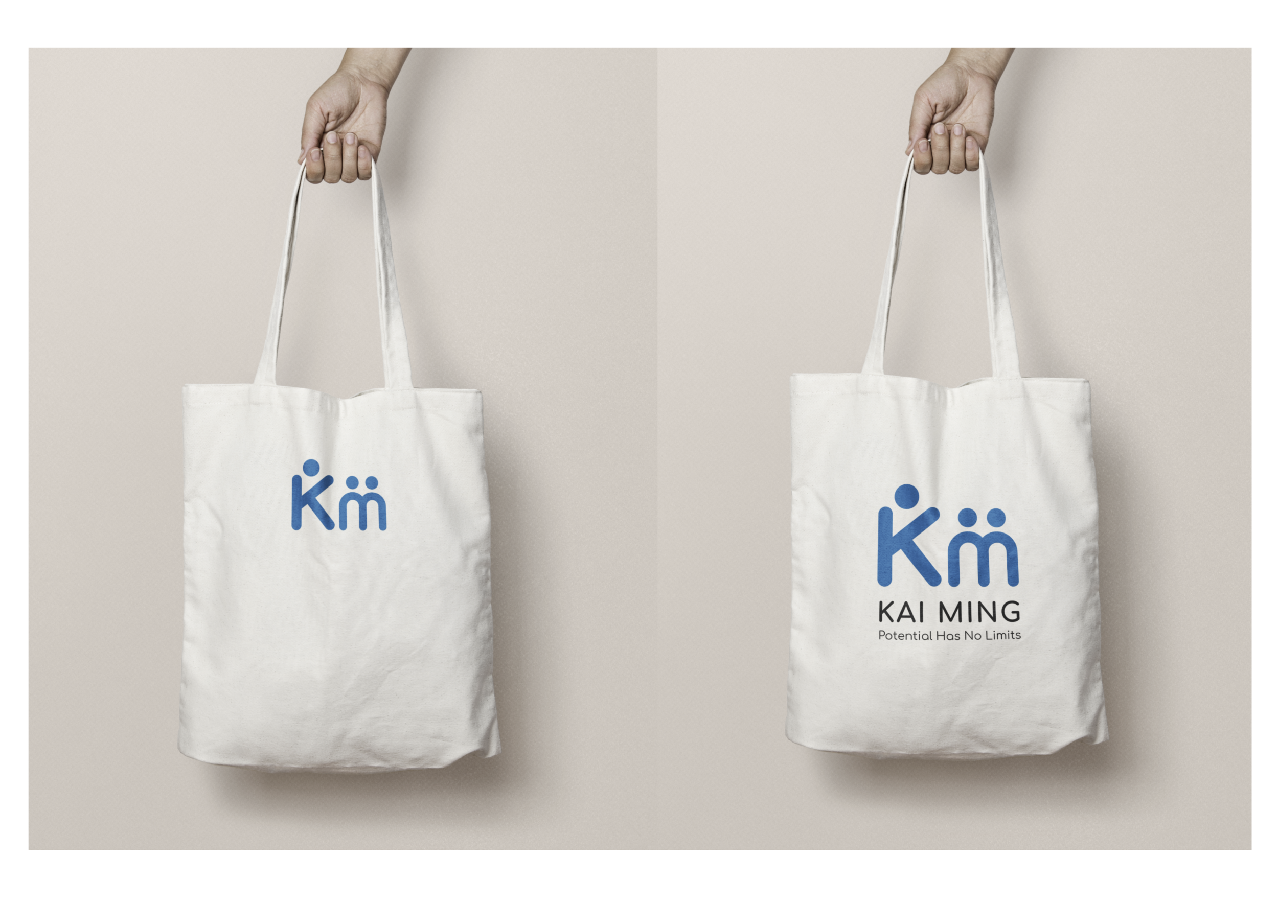
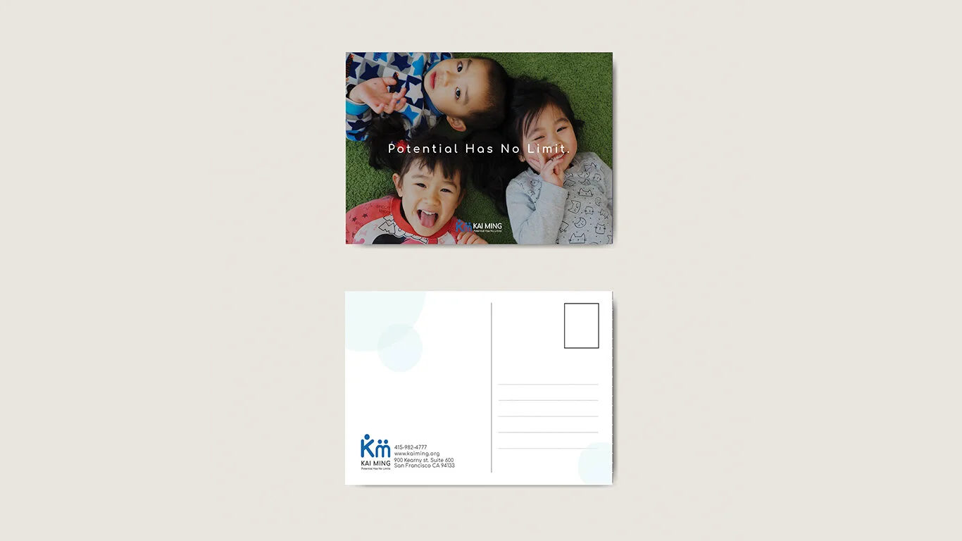
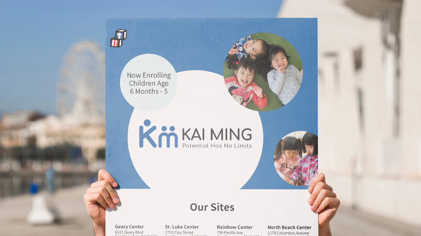
Brand Identity
"Potential Has No Limits" made visible
The new identity needed to hold a contradiction: institutional credibility for funders, and human warmth for families. The solution was a modular mark — stable and professional at small sizes, expressive when applied to print and environmental contexts.
Web Design
A visual system extended to the web
User research revealed the core problem: families couldn't find what they needed, and the visual experience felt cold and confusing. The redesign applied the new brand system to every web touchpoint — clear visual hierarchy, culturally-sensitive imagery, and multilingual layouts built for low-literacy users. The result was a site that communicated the same warmth and professionalism as the brand itself.