Project Overview
This redesign project aimed to improve clarity, accessibility, and emotional trust through a complete overhaul of the site’s content structure, interface, and visual design.
The result was a more intuitive and inclusive platform that received a 93% user satisfaction rate post-launch and continues to help hundreds of families access the resources they need, while also reducing the organization's support burden and allowing staff to focus more energy on child development.
Role
As both the Project Manager and Visual Designer, I managed the full redesign process, from defining goals with stakeholders to delivering the final design system.
My responsibilities included:
・As PM, I facilitated stakeholder interviews, gathered requirements, and built the project timeline.
・As Visual Designer, I redesigned layouts, color palettes, and the design system.
・Coordinated across engineering and content teams to ensure on-time delivery.
・Communicated consistently with stakeholders to maintain alignment.
Problem Statement
・The original website had confusing navigation, inconsistent and outdated content, and failed to convey professionalism and trust.
・Many resources lacked a central online presence, forcing staff to repeatedly handle the same questions manually. Information was often delayed or inaccurate, creating frustration for users.
・Additionally, the enrollment process was paper-based, leading to lost forms, human error, and excessive labor costs.
Challenges
Lack of Research Foundation – The client’s concept was based only on assumptions, with no real understanding of user pain points or behaviors.
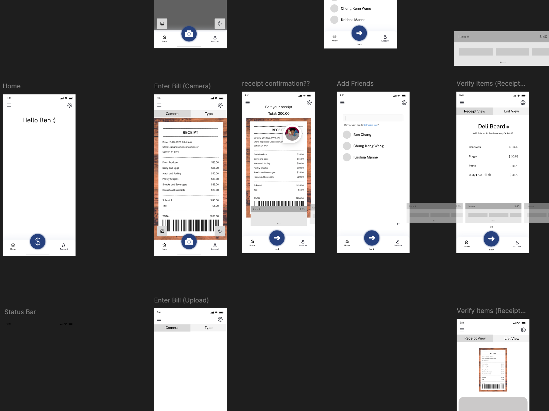
Complexity of Receipts – Different receipt formats, currencies, and unclear itemization posed challenges for accurate scanning and splitting.
Group Dynamics – Splitting bills isn’t just functional; it involves trust and social sensitivity, requiring the design to be simple, transparent, and fair.
Minimal Initial Design – The client’s early prototype lacked hierarchy and workflows, requiring end-to-end design thinking rather than small UI fixes.
Process
・Conducted interviews and requirement gathering.
・Collaborated with the UI/UX design team to review wireframes and the new information architecture, ensuring both user and stakeholder needs were met.
・Built the visual design system and led weekly check-ins to keep progress on track.
User Research Summary
To better understand the needs of Kai Ming’s primary users, low-income, multilingual families seeking early education services, I conducted and help facilitate informal interviews with staff members, reviewed internal support patterns, and audited the existing website’s structure and accessibility.
Key insights included
・Many families relied heavily on phone support due to difficulties navigating the site, particularly non-English speakers.
・Users felt overwhelmed by the amount of scattered information and were unsure which resources applied to them.
・Parents wanted to feel welcomed and reassured when seeking support, not intimidated by formal or overly technical language.
・Staff members reported spending a significant amount of time answering repeat questions that could be addressed with a more intuitive site.
・These insights highlighted a clear need for a more user-friendly, emotionally supportive, and multilingual digital experience, one that empowers families to navigate resources independently and confidently.
Result
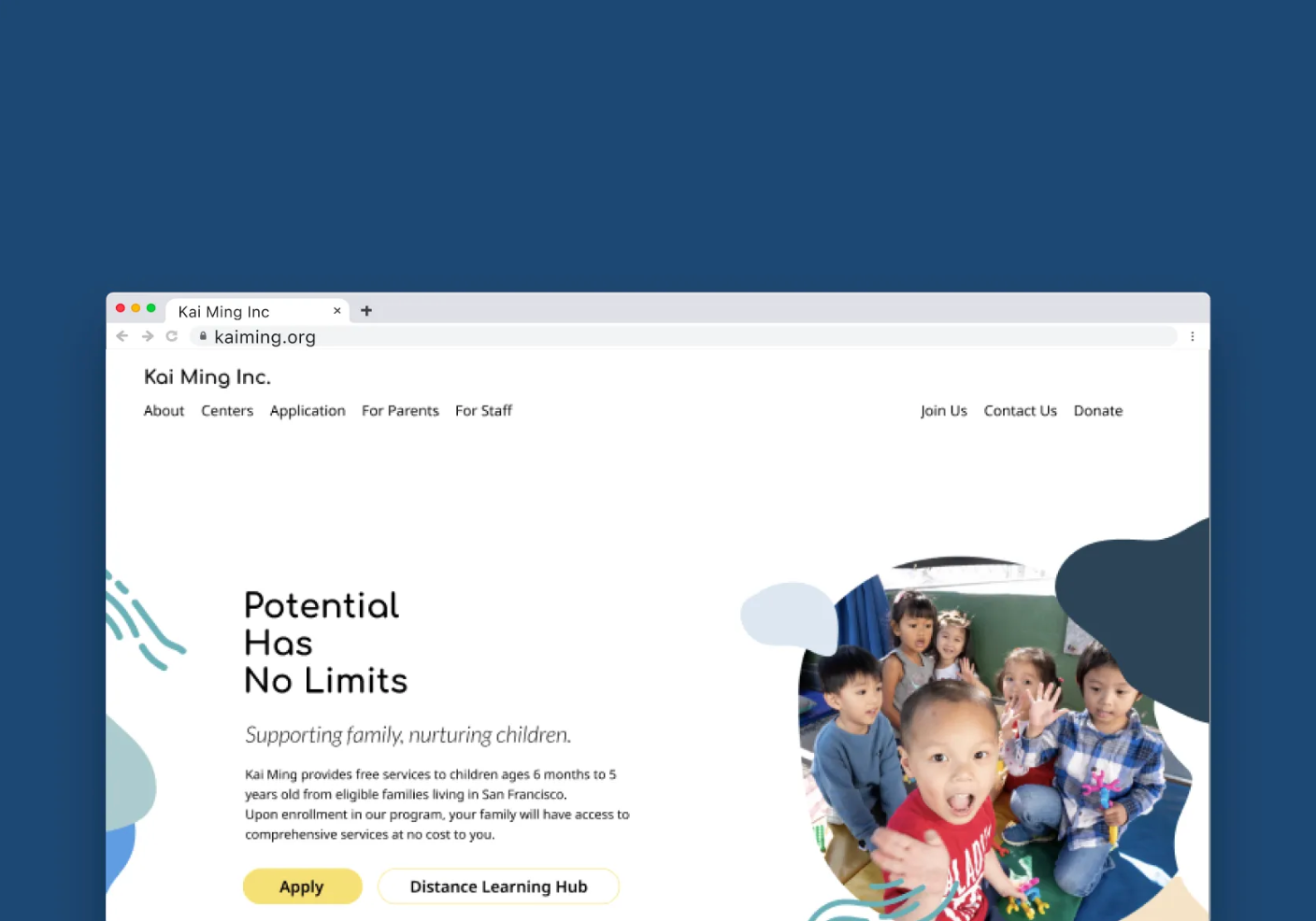
The redesigned website launched on schedule with clearer navigation, making it easier for parents and staff to find resources while strengthening the organization’s modern, professional image.
Achieved 93% user satisfaction and, as of 2025, the site continues to serve over 5,000 active users.