Project Overview
This project focused on redesigning a lightweight bill-splitting mobile app that allows users to upload or scan receipts and share expenses with friends. The client initially provided a very basic prototype with limited functionality, no visual hierarchy, and no user research foundation.
Role
As both the Project Manager and Visual Designer, I managed the full redesign process, from defining goals with stakeholders to delivering the final design system.
My responsibilities included:
・Defined the product goals and target user scenarios through brainstorming and lightweight research.
Led the information architecture and initial task flows to simplify expense tracking.
・Designed the visual system, focusing on clean layouts, approachable color palettes, and a friendly brand identity.
・Facilitated collaboration by keeping the project on track and aligning design iterations with user needs.
Problem Statement
Managing shared expenses is often frustrating:
・Current tools focus on numbers but neglect the user experience of negotiation and clarity.
・Many users struggle with confusion over “who owes what” after group activities.
・Apps on the market often feel cluttered or too transactional, lacking a sense of trust and friendliness.
Challenges
Research & Discovery: Looked into existing bill-splitting apps (Splitwise, Venmo groups) and interviewed friends about their pain points.
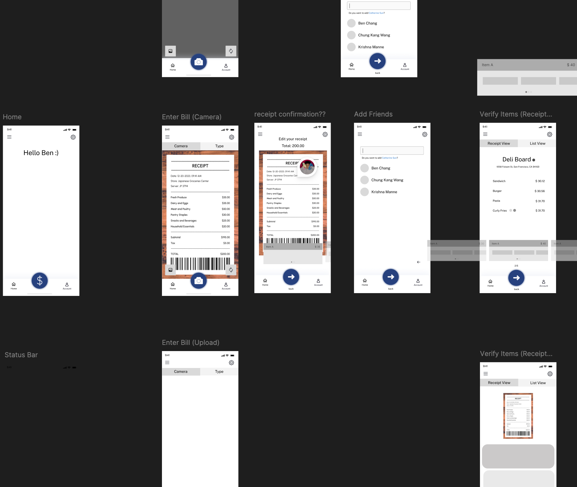
User Flow & IA: Designed a streamlined process to add an expense, assign participants, and view balances at a glance.
Wireframes & Visual Design: Created low-fidelity wireframes, then developed a high-fidelity prototype with soft colors and rounded elements to reduce the tension of “talking about money.”
Iteration: Tested flows informally with peers, adjusting navigation and clarity in the balance overview.
Process
Research & Discovery: Looked into existing bill-splitting apps (Splitwise, Venmo groups) and interviewed friends about their pain points.
User Flow & IA: Designed a streamlined process to add an expense, assign participants, and view balances at a glance.
Wireframes & Visual Design: Created low-fidelity wireframes, then developed a high-fidelity prototype with soft colors and rounded elements to reduce the tension of “talking about money.”
Iteration: Tested flows informally with peers, adjusting navigation and clarity in the balance overview.
User Research Summary
To better understand the needs of Kai Ming’s primary users, low-income, multilingual families seeking early education services, I conducted and help facilitate informal interviews with staff members, reviewed internal support patterns, and audited the existing website’s structure and accessibility.
Key insights included
・Many families relied heavily on phone support due to difficulties navigating the site, particularly non-English speakers.
・Users felt overwhelmed by the amount of scattered information and were unsure which resources applied to them.
・Parents wanted to feel welcomed and reassured when seeking support, not intimidated by formal or overly technical language.
・Staff members reported spending a significant amount of time answering repeat questions that could be addressed with a more intuitive site.
・These insights highlighted a clear need for a more user-friendly, emotionally supportive, and multilingual digital experience, one that empowers families to navigate resources independently and confidently.
Result
The final prototype delivered:
・A simplified expense-adding flow (3 steps instead of 5).
・A clear dashboard showing each person’s balance without overwhelming detail.
・A friendly, modern UI system that built trust around sensitive money matters and less intimidating.
Although Settled was not launched as a live product, the process demonstrated my ability to combine product thinking (problem framing, user flows) with visual design execution, creating a solution that was both functional and emotionally supportive.