Problem
Emotional tools are fragmented: trackers, affirmations, worksheets. Almost none help you complete an emotional experience. Options are either too clinical or too fluffy.
What I Did
Built the entire arc solo: brand strategy, identity system, app UX/UI, and the live website, executed with an AI-assisted workflow, kept honest by real psychology.
Result
dovae is live: website at dovae.co, first digital products shipping, with the app designed end to end as a concept and working prototype.
The Challenge
Plenty of tools. Nothing that completes the loop.
The market is flooded with fragmented emotional tools: mood trackers, affirmation apps, printable worksheets. Almost none help you actually complete an emotional experience: prepare for a therapy session, then capture what you notice afterward. And for high-functioning women who look fine but feel frayed, the options are either too clinical (heavy, stigmatizing) or too fluffy (affirmations that don't work). I set out to build the tool I couldn't find.
The Approach · Brand System
A sequence you can walk, not a mood you're stuck in
I built dovae on one belief: regulating emotion is a sequence you can walk, not a mood you're stuck in. That logic, name what you feel, allow it, settle your body, choose your next move, became the spine of the whole brand, so every product has a clear job.
The visual system pairs Bricolage Grotesque (expressive, humanist) with Hanken Grotesk (calm, clear), over a warm, openhearted palette, the deliberate opposite of clinical white-and-blue. It's designed to feel beautiful and trustworthy: the credibility comes from real frameworks and a licensed-therapist review, not a clinical costume.
Evidence-based emotional tools, beautifully designed, for women who look fine but feel frayed.


The Product · the dovae App
Where the brand system becomes a real experience
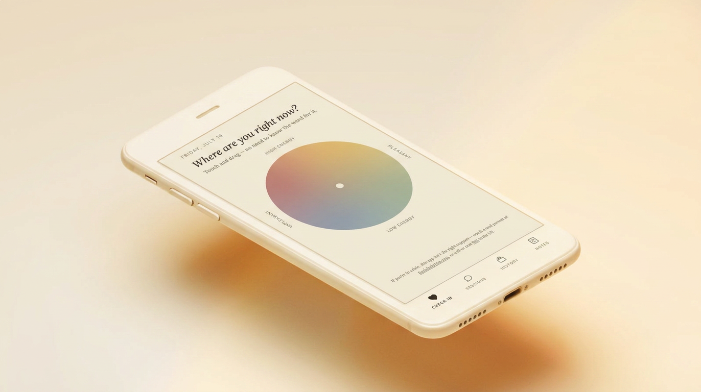
The app is a between-sessions companion that walks you through one full loop instead of another lonely tracker.
01
Prepare
A short guided prep before a therapy session, so you walk in clear on what to raise.
02
Capture
After the session (or any hard moment), record what happened and what you noticed, gently.
03
Track
An observation log that turns scattered feelings into something you can see.
04
Reflect
The app surfaces patterns, so you bring real insight back to your next session.
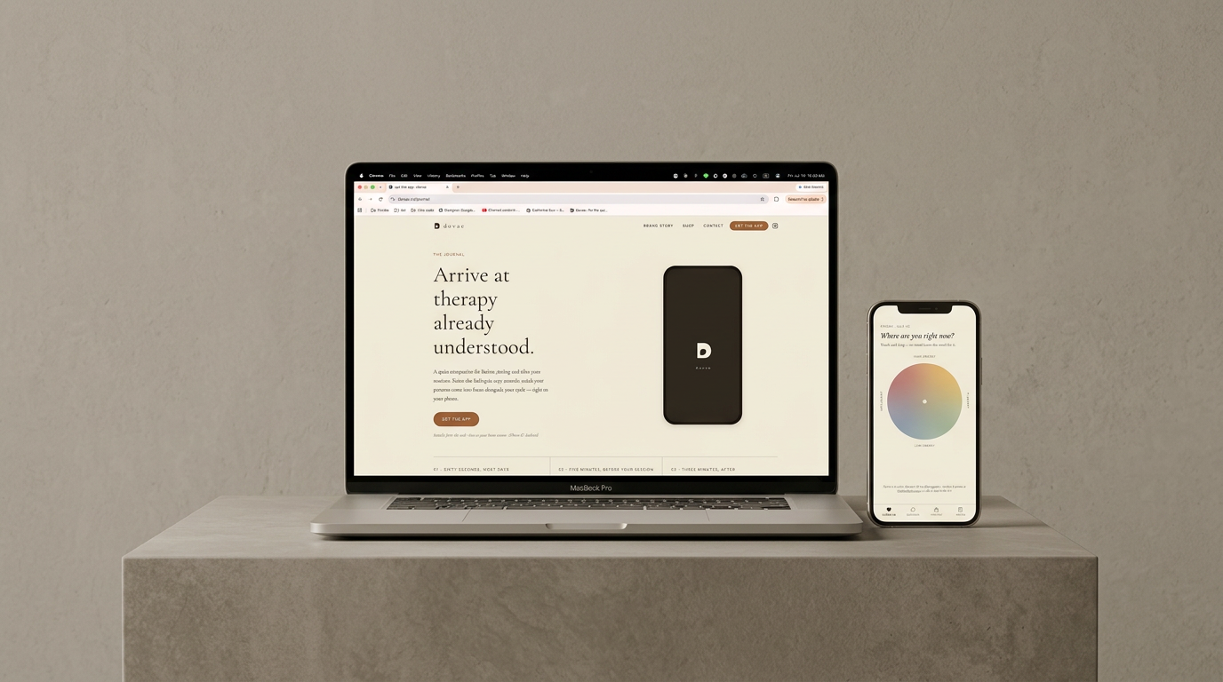
dovae.co and the app, designed and built solo: working product, not a mockup
Design decisions: progressive disclosure so the app never overwhelms an already-overwhelmed user; illustration to make abstract emotional and bodily states legible; and a warm-but-firm voice that guides without preaching. The whole thing was designed and prototyped solo with an AI-assisted workflow: AI for research, copy, and speed; my taste and a clinician's review for trust.
The Results
One person. The entire arc.
dovae is live as a brand: website at dovae.co, first digital products shipping, with the app designed end to end as a concept and working prototype. The real result is the proof of range: brand strategy to product UX to the built site, executed at AI speed and kept honest by real psychology.
Brand
Complete identity system: strategy, wordmark, palette, type, illustration language
Product
App UX + UI designed end to end: concept and working prototype, therapist-reviewed
Site
dovae.co designed and self-built via vibe coding, live with digital products shipping